2026 · editorial · data portrait · linguistics
[g]host in the transcripts
A LENguistic portrait of Lenny Rachitsky, built from 298 of his own transcripts. The interviewer, read back by his corpus.
![[g]host in the transcripts: A LENguistic portrait of Lenny Rachitsky, built from 298 of his own transcripts. The interviewer, read back by his corpus.](/screenshots/ghost-portrait.webp)
- Corpus
- 298 episodes
- Words
- 4.26M
- Lenses
- 5
- Hard part
- two voices, one site
why
Lenny Rachitsky has hosted nearly three hundred conversations with the people who build the products we use. He asks good questions. Across all those episodes, across nearly three hundred guests, nobody had asked him one back.
That’s the observation the project started from. The language in a transcript is data. The questions a host chooses, the phrases he reaches for, the topics he never touches, the way his thinking shifts across years of public conversation — all of it is signal. The question was whether you could read enough of it to write a portrait of the reader.
Built for Lenny’s Buildathon. The brief was make something with Replit. The thing I made is Lenny’s transcripts read back at Lenny.
what I built
A five-lens editorial site grounded in real corpus analysis, rendered as an ASCII portrait you explore by region. lenguistics.replit.app loads on the portrait — no table of contents, no landing copy, no marketing rail above the fold. The portrait is the index.
- D1 — Signature questions
- Cluster analysis across 14,495 questions. Twelve recurring types, one dominant.
- D2 — Silences
- Structural gap analysis. Eight topics never touched in 298 episodes.
- D3 — Idiolect
- Cross-stream contrast with guest language. Twenty-six phrases distinctively his.
- D4 — Shifts
- Arc analysis across four years. Three measurable shifts in register and emphasis.
- D5 — Returns
- Network graph of repeat guests and cited figures. A trust network with a striking absent centre.
Each region of the ASCII face maps to one of the five. Hovering lights the lens, clicking opens the analysis. The five-lens structure is not chapter headings; it is the navigation, the argument, and the portrait, in one move.
the co-equal problem
Data journalism usually picks a side. Visualisation-first sites use prose as scaffolding around the charts. Essay-first sites use data as footnotes. This one refused both.
The constraint I set: a reader can follow the essay and never touch a chart. A reader can follow the charts and never read a word. Either path lands on the same portrait. That single rule drove almost every design decision downstream — the legend in How to read this, the LennyVoice component, the right-rail navigation, the keyboard shortcuts, the mobile pass.
decisions I’d defend
The portrait as entry point, not a hero image. Most editorial sites open with a title card and three feature blurbs. This one opens on a 90×55 grid of characters that is also the navigation. Higher friction by design. The portrait signals immediately that the site is doing something unusual with its data, and it filters for the kind of reader willing to slow down. Same instinct as SPF’s demo-over-signup-wall: the front door is the artifact.
Two voices, two formats — and a cost I won’t pretend I solved. The essay carries my analytical prose and passages written in Lenny’s voice — synthesised reconstructions built from the corpus, not direct quotation. Early drafts treated both as blockquotes. A blockquote was a blockquote. That broke the trust contract before anything else: if a reader can’t tell whether they’re reading Lenny’s actual words or a model’s reconstruction, the whole evidentiary argument collapses. The fix is a dedicated LennyVoice component: dashed left border, synthesised badge, citation reading — Lenny, if asked. And a two-column legend in How to read this that shows both formats side by side, before the reader meets either in the essay. Typography as the line between information and fabrication — drawn in the visual grammar so it travels with the quote instead of living in a disclaimer the reader has already scrolled past. The component is the floor. It is not the ceiling. Honest version of this section lives a few sections down.
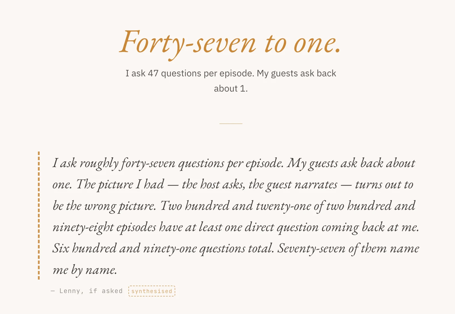
The title as argument. A linguistic portrait became a LENguistic portrait — a small capitalisation embedding the subject’s name in the genre description. Ghost in the Transcripts became [g]host in the transcripts — bracketed lowercase g, a ghost hiding inside its own name. Some readers won’t catch either. The ones who do get a small reward, and a title that enacts the argument it makes about language carrying the person.
Treat the data layer like code. Static JSON over an API, because the data does not change often, an API would add latency, and a runtime store would add an attack surface for nothing. But static files have a known failure mode: they drift. Headers go stale. Counts diverge. So a validate-meta script runs as a pre-commit hook and in CI on every pull request that touches data files. It derives the true episode count from the per-episode histogram in reciprocation.json (a content-derived count, not metadata-checking-metadata) and fails the commit on mismatch with a one-line fix command. Companion generate-meta rewrites all five corpus headers from a single source of truth. enrich-episode-index pulls real episode titles from the podcast RSS and updates the index. The data layer has tests, fails loudly, and the fix is one command. Same shape as Celine’s statutes-as-context: the corpus is ground truth, the system reads it back honestly, the human builds rules around the truth instead of around itself.
what I built for the keyboard
A canvas portrait is, by default, inaccessible to keyboard users and screen readers. That was unacceptable. Tab focus on the rail buttons triggers the same canvas highlight as mouse hover. Arrow keys move between regions. Enter opens the detail panel for the focused lens. Each button carries aria-label, aria-pressed, and a focus ring keyed to the region’s palette colour. A role="status" aria-live region announces the focused region’s name and statistic to screen readers as focus moves. Number keys 1–5 jump directly. The keyboard hint appears in the bottom of the right rail after the reveal animation, and dismisses on first interaction: present for readers who need it, invisible to readers already exploring.
what I built for mobile
The portrait was first a desktop artifact: fixed canvas, mouse hover. Mobile required rethinking the interaction model, not just the breakpoint. The portrait scales to fill the viewport with a slight horizontal crop for a full-bleed feel. The left navigation hides entirely; screen real estate goes to the face. The right rail becomes a fixed bottom strip of region buttons. Tap triggers the visual animation; a second tap on the same region opens the detail panel. Horizontal swipe cycles between regions. A Read on strip in the bottom rail surfaces the five essay sections so a reader can navigate without returning to the article page. The article itself got its own mobile pass: tighter padding, single-column guest signature cards, horizontally scrollable comparison tables, recalibrated clamp() font sizes for 360px viewports.
what the reader pays
The site holds at least four registers in close proximity: my analytical prose, Lenny in his own verbatim words from a transcript, Lenny in synthesised reconstruction, and the data itself reading like prose because the analysis is folded into the writing. The LennyVoice component, the legend, and the typography get a careful reader to this is one of four. They do not, every time, get the reader to this exact line, this exact register. The slippage is real.
Some readers will lose the thread. Some will read a synthesised passage as a quote, or a quote as analysis, and the evidentiary frame will wobble for a paragraph before it resets. I am not pretending the design solved this. The site treats the ambiguity as the point — the host is hard to pin down, the corpus is hard to read, the portrait is built out of slippage — and asks the reader to carry some of that work as the price of admission. Worth it for what it lets the site argue. Not free.
If I shipped a v2, the legend in How to read this would be the first thing on screen, not the third. The page would refuse to open the essay until the reader had hovered both formats. Friction at the right moment, taken from the reader’s middle and given back at the door.
what I learned
The constraint that hurts the most is the one worth keeping. Data and prose are co-equal sounded clean in a brief. In practice it forced two-voice disambiguation, a legend before the essay, a portrait that doubles as nav, and a reading order with no canonical entry. Every one of those came out of refusing to choose between visualisation-first and essay-first. The rule that made the project hardest is the rule that made the project itself.
Voice disambiguation is editorial, not visual. The LennyVoice component looks like a styling decision. It isn’t. It is the line between information and fabrication, drawn in the visual grammar before the reader meets the first reconstructed quote. Same shape as Celine’s info ≠ advice: the line is one verb wide. The design has to carry it, because a disclaimer the reader scrolled past won’t. The design does not, on its own, get the reader all the way home — that’s what what the reader pays is about — but it gets them past the place where a quieter site would lose them.
Start the mobile interaction model first, not last. Designing the canvas for desktop and adapting it for touch cost time and constrained the result. A canvas-built-for-touch-first version would have arrived at the two-step tap and swipe-to-cycle pattern faster. Next time, the mobile model is the design brief, not the deployment phase.
Write the closing reflection first. The five-lens structure is analytically sound, but the essay’s central argument — that curiosity and format have separated from each other in podcasting — needed a home from the beginning. Writing the close first would have sharpened how each section contributed to that thesis instead of discovering the thesis at the end.
the strange loop
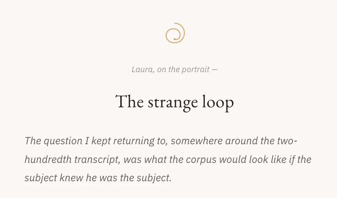
A portrait of an interviewer made out of his own interviews. Written using the same five lenses he uses on others. The strange loop is the point. The site argues — through its data, its structure, its typography, and its title — that the language someone uses in their professional life is not incidental. It is the person, or at least a significant piece of them. And that a sufficiently careful reader can find the subject hiding inside their own transcripts.
[g]host in the transcripts is that argument, made as a product. Live at lenguistics.replit.app.
what’s next
Three I’m watching:
- A second corpus. The pipeline is portable. Any host with three hundred episodes is a candidate; the question is whether the five lenses generalise or whether each subject needs its own.
- A reciprocation tracker. The asymmetry between host and guest questions was the most surprising finding the data turned up. Worth its own surface, not a footnote.
- An editor’s edition. Same site, methodology in the foreground, essay tucked behind it. For readers who came for the pipeline, not the portrait.
See also
All projects- Periodic Table of Taylor Swift Same move: language as data, data as portrait. The Periodic Table builds Taylor Swift out of her lyric corpus; ghost builds Lenny out of his transcript corpus.
- Celine AI Same trick: feed the corpus into context as the model's ground truth, no rules engine. Celine's statutes-as-context, ghost's transcripts-as-evidence.
- SPF Same demo-as-front-door. SPF lands in a populated workspace; ghost lands on the portrait. The product is the entry point, not a marketing pitch.
Working on something similar?
I take a small handful of consulting briefs a year and am always up for trading notes with anyone shipping in this space — send a note.
Or: values behind the work · obsessions that shape it · other projects.