2026 · data viz · research · interactive
The Periodic Table of Taylor Swift
A 283-song catalogue, mapped like elements
- Status
- live
- Surfaces
- 5
- Demo
- open
- Hard part
- schema before viz
why
In 2003 chemistry class I drew a Periodic Table of Milk Mustaches: atomic numbers, columns, rows of properties, the format used as a joke and outliving the joke. Twenty-three years later, looking at the Swift catalogue, that frame was the one that finally fit.
Every Swift project on the internet is a tier list, a ranking, or a chronology. They all answer the same question (what’s best, in what order) and they all flatten the catalogue into a line. The catalogue isn’t a line — it’s a structure: songs cluster by era, by emotional charge, and by something like reactivity, which is how readily a song bonds with another song years away. That’s a periodic logic, not a chronological one.
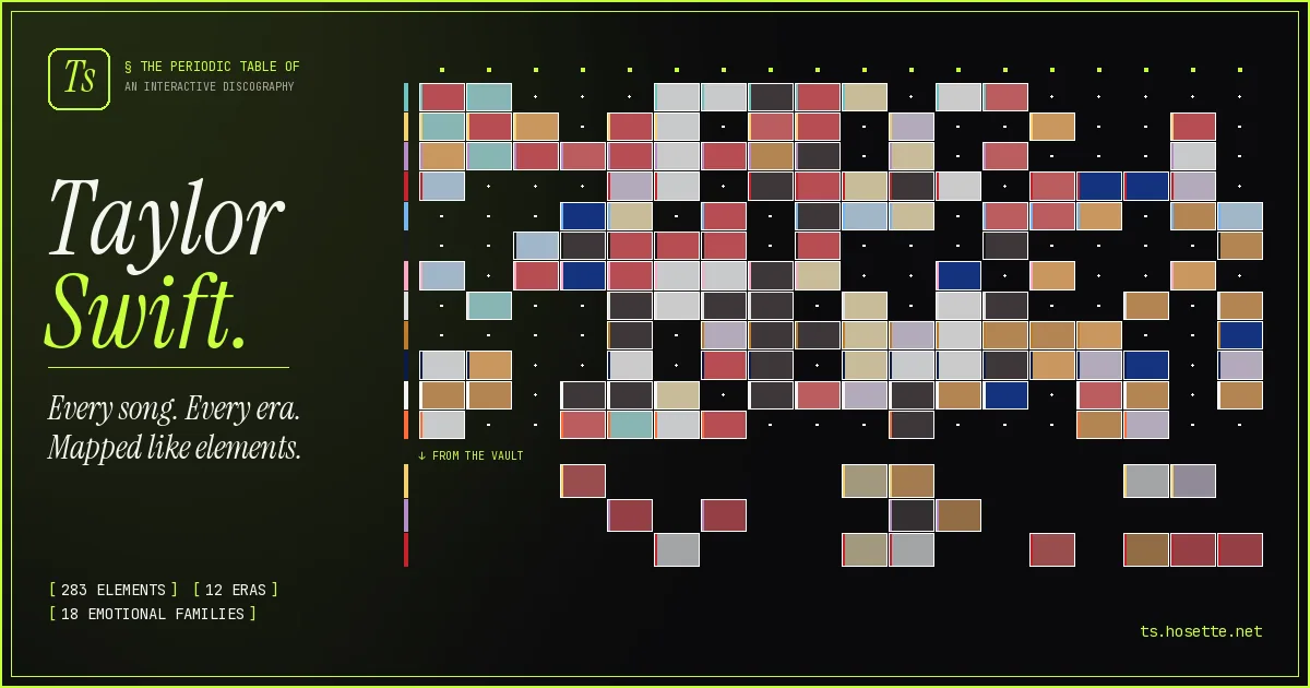
The Periodic Table of Taylor Swift (ts.hosette.net) is the site that takes the metaphor seriously. 283 songs as elements with stable numbers, symbols, columns, rows, and bonds, plus a working lab notebook of the decisions that shaped the grid.
what I built
- Songs
- 283
- Eras
- 7
- Families
- 18
- Bonds
- 234
- Findings
- 13
Five surfaces, one dataset:
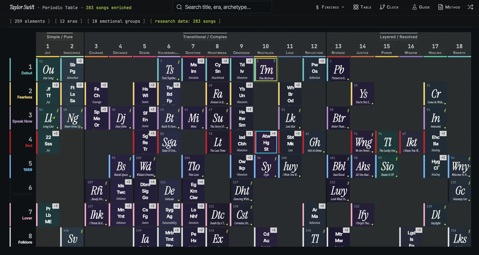
- The Grid: an 18-column table over 7 chronological periods. Eras as rows, emotional families as columns, vault tracks shelved at the bottom.
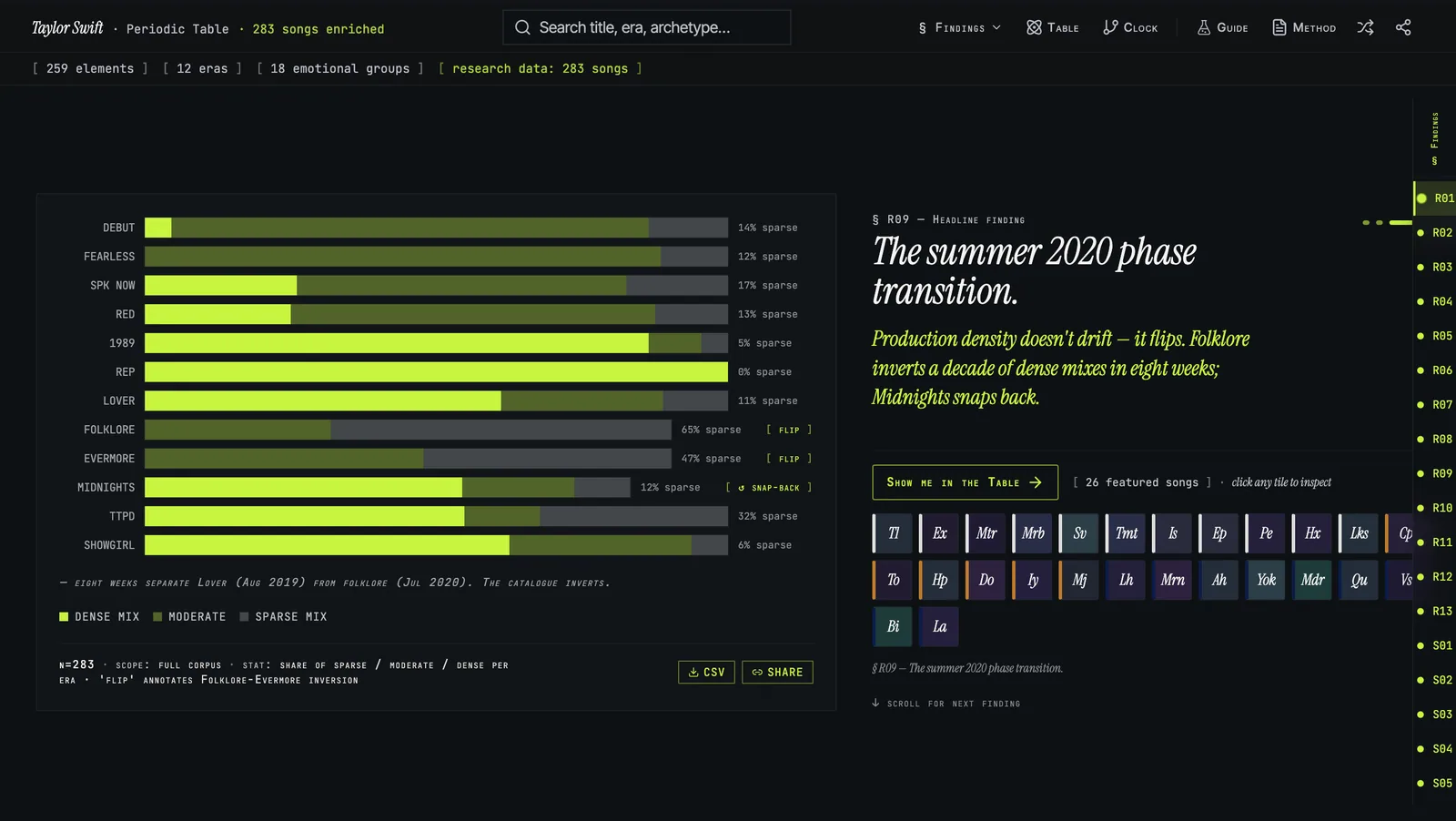
- Insights: 13 R-series findings rendered as scrollytelling charts (vocabulary curves, producer fingerprints, controversy timelines, a 3rd-person POV ledger).
- The Mirror Clock: a 12-spoke radial visualization of 234 thematic connections (reflections, evolutions, echoes, contrasts) drawn as chord bundles between songs that answer each other across years.
- The Lab Notebook: a dated, numbered, never-edited record of every method change and anomaly, in the project’s own voice.
- The Reading Guide: legend, glossary, orientation tour, scoped to the lab’s typography.
The demo loads with no signup and reseeds itself. The catalogue is the pitch.
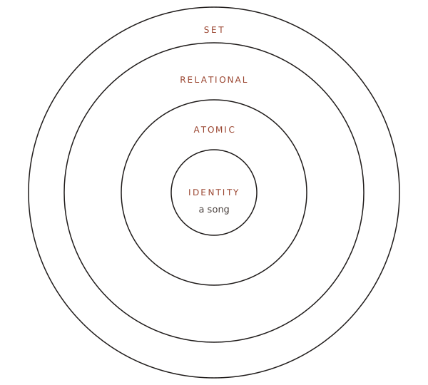
The grid is the surface. Underneath, every song carries four nested rings of properties: from identity (atomic number, title) to atomic (era, family, mass, reactivity) to relational (bonds, mirror pair, group) to set (traits, controversy score, recording-era flag). The schema is the project; this is its shape:
the chemistry
The metaphor is doing more than decoration. The actual periodic table works because of three load-bearing ideas, and the Swift catalogue maps onto each.
Atomic number, the stable ID. In chemistry, atomic number is the count of protons that makes hydrogen hydrogen regardless of isotope or compound. The Swift analog is chronological-release position 1–283 — the one fact about a song that doesn’t move when the catalogue does. Taylor’s Version re-recordings keep the original’s number, vault tracks slot in around their parent album. Anything else can change. The number can’t.
Periodicity, properties that recur. A column in chemistry is meaningful because every member behaves similarly. The Swift analog is the eighteen emotional families. Family on this grid means a column you can make a prediction from: which Reputation-era song answers the Lover-era song in the same family? The grid is doing real work whenever the answer is a specific song.
Predictive gaps. Mendeleev’s 1869 table left blank cells where the schema said an element ought to exist, and predicted gallium and germanium before either was isolated. For Swift, the gap principle produced a weekend with fan wikis: certain era × family cells should have more songs than the streaming catalogues had surfaced. 49 of those gaps turned out to be real songs. The schema knew before the data did.
That’s why the metaphor isn’t decoration. The chemistry is borrowed for its organizing discipline — atomic number as stable ID, periodicity as predictive, gaps as features. A pretty grid of song tiles wouldn’t have caught the 49 missing songs.
decisions I’d defend
Treat the metaphor as a constraint, not a skin. Every observation about the catalogue has to be expressible in era × family coordinates with bonds as a separate layer. If a finding can’t be drawn on the table, the finding probably isn’t real. That rule killed three “interesting” charts and forced one anomaly (Ronan) to become a trait flag instead of a new row.
Build a lab notebook before building features. The Notebook page exists because I kept making the same data decision twice. Now every method change gets a permanent dated entry. Rejected ideas stay rejected. Readers see the working, not just the result. It’s the most-loved page on the site and the cheapest to maintain.
Commit to one identity, not a theme system. The “Lab” voice (chartreuse on near-black, Instrument Serif italic display, JetBrains Mono for atomic numbers, 2px sharp corners) is enforced project-wide via a memory file the AI consults on every change. Visual budget stays small so each era’s palette can take over a drawer without fighting the chrome.
what I learned
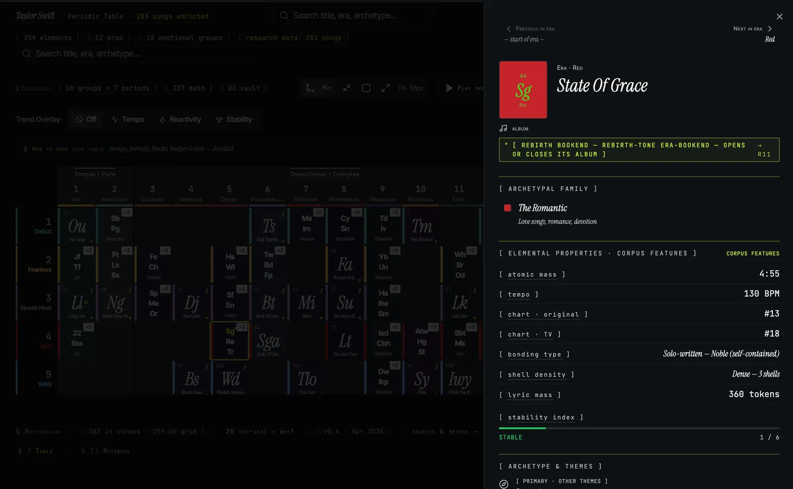
Schema before viz. Deciding what atomic number, mass, reactivity, and family meant for a song was the project. Once the schema stabilized, the layout fell out in an afternoon. Most data-viz projects skip this step and end up with a beautiful chart of an unconsidered dataset.
Bonding is a sharper question than ranking. Every Swift project on the internet sorts the catalogue. None ask which song bonds with which, across eras. Reactivity turned out to be more revealing than any ranking system, and harder to fake.
The dataset is the product. A weekend cross-referencing four fan wikis and BMI registrations to find 49 missing songs is invisible in the interface and the entire reason the site is trustworthy. Same hand-edited-after-AI pattern in Pocketbook: the model writes first, I catch the misreads.
Show your mistakes. The Notebook started as an internal scratchpad and became the page that earns the most trust, because it admits the catalogue used to be wrong and explains how it got fixed.
the receipts
The Lab Notebook is the most-loved page on the site. The discipline that produces it is portable: the public starter is at /lab-notebook-starter.md, with the load-bearing rule from TS quoted at the top:
The premise: most research and data projects pretend to a polished finality. A lab notebook makes the messy middle visible by recording, in chronological order, every methodology change and every anomaly. The rule is simple. When something changes, you write a new entry. You do not rewrite the old one. Reversals are noted in place (“reversed YYYY-MM-DD because X”), not deleted.
The polished result is trustworthy because the messy middle is readable.
try it yourself
Drop /lab-notebook-starter.md at the root of a research, data, or content project. Rename to whatever fits (notebook.md, lab.md, findings.md) and start adding numbered, dated entries. Sections cover method changes, anomalies, findings, and reversals, noted in place rather than overwritten, so the file ages legibly. Sister to decisions-starter.md: that one records what you decided not to build, this one records what you observed and how the method changed. The never quietly edit history clause is the actual mechanism.
what’s next
- Open the dataset: publish the 283-song corpus as a downloadable CSV with the full schema (eras, families, bonds, mirror pairs, traits) so other people can run their own analyses against it.
- Generalize the engine: the era × family × bonds model isn’t Swift-specific. It works for any artist with a long catalogue and enough fan-driven taxonomy to argue about. Beyoncé, Springsteen, Mitski on the same grid.
Live site: ts.hosette.net.
See also
All projects- SPF Built in the same Lovable kiln, surfaced as a different shape. Both projects insist the diagram does the thinking: the periodic table is a spec; the SPF dashboard is one too.
- Inventor Strudel Visualization-as-pedagogy. Inventor Strudel teaches by ear before sentence; the Periodic Table teaches by adjacency before label. Both refuse to make the reader read first.
Working on something similar?
I take a small handful of consulting briefs a year and am always up for trading notes with anyone shipping in this space — send a note.
Or: values behind the work · obsessions that shape it · other projects.