2026 · kid software · creative tools · craft · PWA
Pixted
A craft tool for my young nephew, named in his grammar
- Status
- live
- For
- one six-year-old
- Tools
- ~38
- Hard part
- iPad Safari
why
My young nephew is six. KidPix — the creative app that ran on every elementary-school computer from 1989 onward — is effectively gone from the modern web. The descendants I tried either too app-store, too in-app-purchase, or too clean-vector to feel like the thing he gestures at when my nephew asks to “make a picture.” I wanted scissors. I wanted construction paper. I wanted to peel a sticker off a sheet and put it on the page. I wanted a TV button that played the drawing back.
I wanted to give kids a place to do all of that. Pixted is what I built. Live at pixted.fun: no signup, no account, no app store. Open it on the computer (or iPad, if you must), draw a thing, walk away, come back tomorrow — your Pix is still there.
The name is his. Pix was already a word in the codebase for a finished drawing, the way a Polaroid is a Pic. Past tense: I pixted a dinosaur. He used the conjugation before I did. The whole project is built around defaults a six-year-old would invent words for. It was originally Pixted, like “fixed.” Others began to called it Pixt-ed, and that makes as much if not more sense.
what I built
- Layers
- 4
- Tools
- ~38
- Combos
- 5 hidden
- Paper colors
- 14
- Stickers
- 33
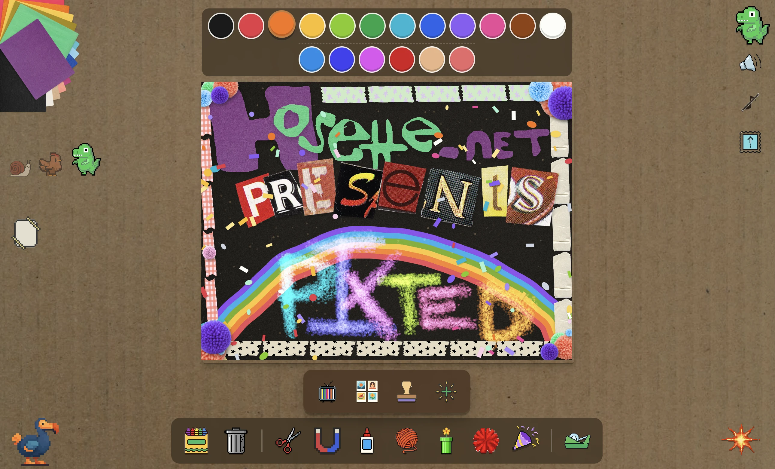
A canvas app stacked four real <canvas> layers deep — paper, pieces, strands, sprites — so paint, construction paper sheets, yarn, and stickers each live on their own surface and compose without fighting each other. A bottom tool tray, a top color palette, a corner-anchored construction-paper fan, character pets in the margins, a dodo on undo. No words anywhere in the UI; every affordance is a graphical icon, because the user is six.
- Paint family
- Pencil, marker, crayon, paintbrush, spray, wax-crayon (invisible until painted over), rainbow drag, glitter, glitter-glue, paint bucket. Each tool has its own sound and its own brushy feel.
- Craft family
- Construction paper (14 photographed sheets fanning from the top-left corner), scissors that cut closed shapes out of any layer, glue that affixes loose pieces, tape that crosses pieces and sticks them down, yarn and pipe-cleaner as stamp-along-path brushes, real-photo pom-poms, stickers, stencils, footprints trails, ants that march.
- Effect family
- Boom (kaboom, paper goes), dissolve, melt, fold (rorschach), invert, hue-shake, cd-spin, tv-pixelate, spiral, rain that wets the construction paper.
- Hidden combos
- Rain on construction paper darkens the paper with a real wet-paper texture. Pom-pom dropped on a glued-down sheet snaps and stops bobbing. Sun placed near wax-crayon makes the wax drip. Stamp pressed onto a glitter pile gold-leafs the signature with one of three photographed leaf scraps. Scissors cuts that close around stamps / stickers / pom-poms carry them on the cut piece.
- Replay
- A TV button plays the Pix back action-by-action. A GIF export saves the playback. Each tap, drag, and effect was recorded in time order so the replay is the same Pix being drawn again.
- Sound
- Texture samples for every tool. Six original music tracks the kid can toggle on independently of the SFX mute, because a kid who silenced sound effects still wants to dance.
decisions I’d defend
Real photographed materials, not illustrated stand-ins. The construction paper is fourteen actual scanned sheets. The pom-poms are eight real photographed pom-poms. The wet-paper texture is a real wet sheet I photographed. The gold-leaf overlay is three real leaf scraps. Vector cartoon stand-ins would have been smaller files, sharper at any zoom, easier to recolor — and they would have read as software. A six-year-old’s brain knows the difference between picture of a thing and actual texture of a thing faster than a critic’s brain does. Same anti-modernization refusal that runs through flowerpostcards’ AIM chrome.
No words anywhere in the UI. A six-year-old reads about as fast as a fluent adult reads a foreign language. Every label slows them down and every menu requires them to stop drawing. Pixted has zero text in the canvas chrome: the tool tray is icons, the color palette is dots, the canvas-style picker is paper swatches, the dodo on undo is a dodo. The cost is discoverability for the older sibling who wants to know what a tool is named; the benefit is that the kid can use everything before they can read it. Same instinct as Pocketbook’s no-CMS, no-feed design for a ninety-nine-year-old: build for the named user, not the generic one.
Hand-placed everything. Construction paper sheets land slightly crooked. Stamps tilt ±4°. Pom-poms bob on their own clocks. Stickers in the picker fan radiate from a corner with per-card lateral jitter. Nothing is on a strict grid because the canvas is supposed to be a desk, not an interface. This is the Schwulst-tradition handmade-web move at kid scale: the imperfection should feel drawn, never filtered. No noise overlays, no fake-paper textures generated by AI — actual photographed paper, actual hand-rotated transforms, actual offsets baked into each placement at creation time.
No accounts, no save buttons, no signup. Open the app, draw, walk away. Autosave fires on tab-hide and beforeunload. Pixes are listed in a gallery accessible from the joy strip. A six-year-old doesn’t tap a save button; they get pulled to dinner. Same front-door-is-the-app pattern as SPF and URL-as-config as Inventor Strudel: the demo isn’t a demo, it’s the app.
Hidden combos reward exploration. Rain plus construction paper darkens the paper. Sun plus wax-crayon makes the wax drip. Glitter plus stamp gold-leafs the signature. None of these are documented anywhere. KidPix taught a generation of children that the way to discover a tool is to try it with another tool; combos arrived through cafeteria gossip (“did you know you can…”). Pixted has five so far. The kid finds one, tells the next kid, the next kid tries it. The discovery loop is the marketing.

the receipts
The five combos live in their tools’ source. The rain combo, condensed from src/tools/rain.ts:
animateRain(comp, () => {
  // Rain finishes. Apply the lasting effect (paper bleed) AND
  // wet every construction-paper piece on the canvas for ~15s.
  // Wetness isn't serialized — paper dries before grandma opens
  // the saved Pix. The bleed IS serialized; replay re-applies it
  // deterministically using the recorded seed.
  const action: RainAction = {
    intensity: BLEED_INTENSITY,
    seed: randomSeed()
  };
  applyRain(comp, action);
  wetAllPieces(WET_DURATION_MS);
  timeline.record("rain", action);
});
The stamp-on-glitter combo, from src/tools/stamp.ts and src/state/stamp.ts:
// Was this stamp pressed on a glitter pile? If so, ink the
// signature gold-leafed using one of three real photographed
// leaf scraps. Variant picked deterministically from the stamp's
// own id so the same stamp always re-renders with the same leaf.
const goldLeafed = hasGlitterNear(x, y, STAMP_PICKUP_RADIUS);
addStamp(x, y, currentSignature, goldLeafed);
The four-layer compositor that keeps paint and craft on separate canvases so they don’t ghost each other:
//   paper:    smooth paint, bucket fills, paper texture
//   pieces:   construction paper sheets, scissor-cut shapes
//   strands:  yarn, pipe cleaner (stamp-along-path)
//   sprites:  stickers, stamps, pom-poms (pixelated, on top)
//
// Each layer has its own DPR-scaled bitmap, its own repainter
// registry, its own redraw triggers. Compose by stacking.
The whole thing is vanilla TypeScript + Vite. No React, no framework, no router. The PWA manifest exists so the kid’s parent can add Pixted to the iPad home screen and it opens chromeless.
what I learned
Designing for one named six-year-old set sharper defaults than any kid-software persona would have. No accounts, no signup, no in-app purchases, no text. Autosave per session. Soft pets in the margins. The dodo on undo. Six-year-olds don’t read; mine knows what a dodo looks like; the design follows. Same lesson Pocketbook taught me with my grandmother: a single named user generates rules that a UX persona never would.
Real photographed materials read truer to kids than to adults. I went back and forth on whether the time spent finding the best image of real construction paper was worth it. Software-grade vector versions would have been faster to ship and worse at the only thing that mattered.
iPad Safari is the hardest target on the public web. Per-tab memory caps, opaque OOM kill behavior, decode pressure from large SVGs, canvas backing-store budgets that aren’t documented anywhere. I shipped multiple incomplete fixes before Codex caught the actual root causes in one cold pass — boot-time SVG decode avalanche from 33 sticker tiles all decoding at once, missing pixel-transform replay after redraws, canvas memory budget across the full layer stack instead of per-axis, autosave failures becoming unhandled rejections that iOS reads as “page wedged.” The meta-lesson was about my own debugging anchoring: after two failed iterative fixes, switch to cold systemic audit, not a third iteration.
Hidden combos are a feature, not a stretch goal. KidPix taught me that kids discover things by trying them with other things, and they tell other kids about what they discovered. Five combos shipped: rain wets paper, sun melts wax, glitter gold-leafs stamps, scissors carries sprites, pom-poms snap to glue. None are documented anywhere in the UI. The discovery isn’t the feature — the telling someone about the discovery is. Pedagogy by gossip.
No-text UI is harder than it looks AND worth it. Every icon I shipped had to read as the right tool to a six-year-old who can’t read the alt text. Some icons went through five revisions. The construction paper fan was four redesigns. The sticker picker took five passes before it stopped reading as “list” and started reading as “stickers spread on a desk.” Tied for the hardest part of the project, with iPad Safari. Both are the same shape: refusing the easy default in favor of the right one.
what’s next
Three threads in priority order:
- Voice samples. Right now every sound is a texture (pops, thuds, fwips, music loops). KidPix’s identity was its voice: a chorus of recorded “oop!” “neat-o!” “wahoo!” exclamations that gave the app personality across every tool. Six-year-olds notice the absence. I am recording my own bank of voice samples to fill the gap. The Dodo on undo gets a voice in this pass too.
- The Goofy Alphabet. A version of the Letters tool where each letter has its own voice sample, its own animation, its own arrival on the canvas. KidPix’s was the showcase feature for the four-to-seven crowd; Pixted’s Letters tool currently just drops paper cutouts of letters and is much quieter than it should be.
- Slideshow. Multi-Pix presentation mode with transitions, so a kid can flip through everything they made this week. The compositor and the Pix-store already support enough state to make this a layout problem, not a data problem.
Live at pixted.fun. Open it on the computer. Tap a tool. Walk away when you’re called for dinner. As fun for grown-ups as it is for kids.
See also
All projects- Pocketbook Two projects built for one named person — a ninety-nine-year-old grandmother and a six-year-old nephew. The constraint that falls out of designing for somebody specific is sharper than any persona document. Both projects ship the defaults the named user would actually pick.
- flowerpostcards Two refusals of the modern simplification. flowerpostcards keeps the 1998 AIM chrome because the chrome is half the meaning; Pixted keeps real photographed construction paper, yarn, and pom-poms because illustrated stand-ins read as software, not craft.
Working on something similar?
I take a small handful of consulting briefs a year and am always up for trading notes with anyone shipping in this space — send a note.
Or: values behind the work · obsessions that shape it · other projects.