2026 · personal · team · tiny tool
Office Hours
A dashboard for friends across timezones, opened to any team
- Status
- live
- Personal
- 8 cities
- Open
- 100 cities
- Stack
- 1 HTML file
- Hard part
- refuse the default
why
I was missing my former colleagues in Egypt one warm April evening in New Orleans, sitting next to the jasmine with my laptop, and the time-zone math was the small recurring friction in keeping in touch. I wanted to make them something useful: a tiny dashboard that says exactly where everyone is and what time it is there. Simple idea, simple execution, made with love.
Then I wanted a version anyone could have. The personal one stays at the root, frozen on Cairo plus four US cities, because softening that into a configurable default would have softened both. So a second variant lives at /open (same dashboard, same hand-drawn landmarks, same paper-and-ink palette), but the user picks the cities, names the dashboard for their team, and shares the URL. Friends become anyone’s team.
what I built
A single static HTML file. No build step, no framework, no signup wall: same minimum-deploy stack as flowerpostcards.
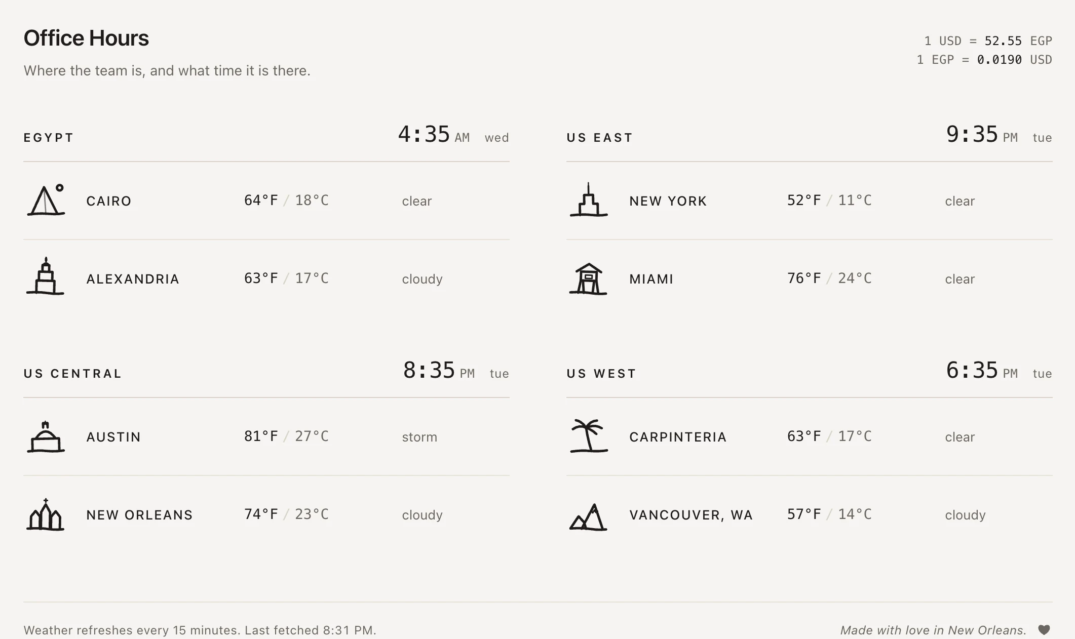
The personal version. Eight cities grouped into four timezones (Egypt, US East, US Central, US West). Each timezone has one shared clock so the dashboard never shows two ticking clocks for cities that share a zone. Each city has its own hand-drawn landmark (Cairo’s pyramid, Alexandria’s lighthouse, Austin’s Capitol with a Lone Star), a few SVG paths in marker-style strokes. A live local weather pull from Open-Meteo gives every row both Fahrenheit and Celsius. A header band reports any public holiday in either country (Nager.Date) and quietly disappears on days neither has one. The corner shows the current USD/EGP rate, refreshed hourly.
Open Office Hours at /open stretches the same idea into a hundred cities: every populated UTC offset on Earth, from Pago Pago at −11 through the half- and quarter-hour zones (Tehran, Kathmandu, Kabul, Yangon) out to Suva and Apia and Kiritimati at +14. Same marker-stroke landmarks: Denali for Anchorage, Boudhanath stupa for Kathmandu, Shwedagon Pagoda for Yangon, Cabot Tower for St. John’s. The customize panel takes up to four timezones, two cities each, and a name for your dashboard. The URL is the whole config: ?c=cairo,nyc,tokyo,sydney&t=Acme+Standup. Paste it into Slack and your team lands on the same dashboard. localStorage holds the last-applied state per browser.
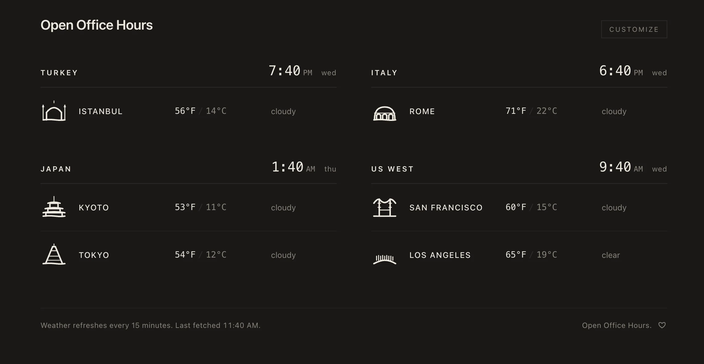
A small heart at the end of the footer next to Made with love in New Orleans fills in light mode and outlines in dark, doubling as the theme toggle: a quiet flourish that turns out to be a control.
the geography
Most timezone tools strip the place out. World-clock widgets show UTC offsets and round clock-faces; coordination apps default to block out 9 to 5 your local time and expect the other side to do the math. The default has a name in distributed-work research: follow-the-sun, the customer-support model where work hands off across zones in a fixed direction so someone is always awake. It works only if the handoffs are clean, the conventions are shared, and nobody’s hours get treated as the default hours. Most distributed teams flunk the third condition.
Office Hours is built on the opposite logic: no default convention wins. Three details fall out of that:
- Both conventions, every row. Egypt and the US share the personal dashboard. Defaulting to Fahrenheit or Celsius is a small disrespect, so the page does neither: both units appear on every row, the local convention rendered first and the other in softer ink. The Open variant scales the same logic differently: each city inherits its own local convention.
- Place is carried by landmarks, not labels. Cairo in a dropdown is a string. The Cairo row in Office Hours has a hand-drawn pyramid — something that takes about as long to register but does completely different work. The dashboard reads as places-that-keep-time, not time-zones-with-city-labels-attached.
- Empty space is content. Most days neither country has a public holiday, the band silently hides, and the page reads as an ordinary weekday. The band only appears when it actually matters. The dashboard is doing diplomacy by what it doesn’t show as much as by what it does.
A simple tool can carry a real argument about how to coordinate across distance: defaults are political, place isn’t a label, silence is information. Three rules, falling out of the frame as cleanly as the chemistry rules fall out of the Periodic Table.
the receipts
One city record, verbatim from index.html. Every city in the hundred-city library is shaped this way:
cairo: {
  name: "Cairo",
  tz: "Africa/Cairo",
  lat: 30.0444,
  lon: 31.2357,
  mark: SVG_OPEN +
    '<circle cx="33" cy="9" r="2.4" />' +
    '<path d="M 4 32 Q 14 31 22 32 Q 30 33 36 32" />' +
    // …pyramid silhouette, palm fronds, base line
    SVG_CLOSE,
}
The timezone-to-label map for the personal version, also verbatim, where Africa/Cairo is technically correct; Egypt is what the dashboard shows:
var TZ_LABELS = {
  "Africa/Cairo":        "Egypt",
  "America/New_York":    "US East",
  "America/Chicago":     "US Central",
  "America/Los_Angeles": "US West",
  // …Eastern Canada, Mexico, Brazil, etc. for the Open version
};
The whole tool is one HTML file at index.html and one at open/index.html: no build step, no dependencies. The hundred-city library is one JavaScript object literal in the file. If the project outlives me by a decade, it’ll be because there’s nothing to maintain.
decisions I’d defend
A single HTML file, both versions. Astro would have been overkill for eight rows of data and a toggle, and overkill for a hundred cities and a customize panel too. Vanilla HTML keeps the deploy story trivial and the page weight tiny. The whole tool (friend version and team version both) is readable in one scroll of source.
Hand-drawn landmarks, not an icon set. The dashboard is a tool, not a portfolio piece, but a small piece of personality on each row makes it feel made-for-someone rather than auto-generated. Each landmark is a handful of SVG paths indexed by city ID, so the hundred-city library kept the same hand even when it grew past the original eight.
The URL is the whole config in Open. No accounts, no backend, no save button. Same lineage as SPF’s demo workspace and Inventor Strudel’s save-by-URL: make the link the product. State of what cities, what name, what theme lives in ?c=...&t=... plus one localStorage key per browser. Lightest possible version of shareable with your team, and the only version that survives me not maintaining a server.
Personal version stays personal. Folding the friend-group dashboard into the configurable one would have flattened the thing that mattered most. The eight cities at the root are a real list of real people, not a default config. Two URLs, one tool, two purposes.
what I learned
A simple idea executed simply outperforms a clever idea executed well. The personal tool took an evening, and the hardest decisions were what to leave out: no notifications, no calendar integration, no per-city detail page. Every cut made the dashboard more useful, not less. The Open expansion taught me a smaller version of the same lesson: a hundred cities still fit in one HTML file when each one is just a name, an IANA string, two coordinates, and a few SVG paths.
The empty state is the product, too. Most days neither country has a holiday, the band silently hides, and the dash reads as a normal weekday. The choice is to trust silence as a real piece of the interface, not an absence to fill with placeholder copy.
This project was made with love, and that phrase lives in the footer as an italic line with the heart toggle next to it. It is not a feature; it is the thing.
what’s next
A few small open questions:
- A quiet weekend-vs-weekday tint per row so a timezone with someone working off-hours reads as off-hours
- A small inline note when a city’s weather looks unusual for the season (snow in April in Cairo)
- A holiday band for Open that scales (any public holiday across any of the four timezones you picked) once I figure out how to do it without leaning on an API the project is supposed to outlive
Live at oh.hosette.net for the friend version and oh.hosette.net/open for yours.
See also
All projects- Omunikorudo Personal first, configurable second. Frozen on a single instrument or a friend group, then opened up. The constraint of the original is the form.
- SPF Small, handmade tools that don't ship until the metaphor is named. SPF is sprint protection, not sprint planning; Office Hours is where everyone is, not where everyone needs to be.
Working on something similar?
I take a small handful of consulting briefs a year and am always up for trading notes with anyone shipping in this space — send a note.
Or: values behind the work · obsessions that shape it · other projects.